
Colors, Dots, and Smells, OH MY!
Look, I do not use this title lightly. I despise the commercialization and appropriation of a religion/spirituality/tradition/practice—whatever you define Zen as. I often find myself rolling my eyes at the latest app claiming its use will help induce some blissful state of meditation almost automatically, or a new “zen” spa treatment that will somehow bring you enlightenment. But hang with me for a bit and you’ll see just how appropriate it is in this case.
As I was discussing in my previous post, my search for accessible forms of Golden Age comic books (in their original form) led me to a bit of a dead end. But I did not let this end the search. Although I was only left with black and white images, I did see a great deal of ads and nostalgic content that inspired me to forge ahead in my random research. From here, I decided to assess the New York Public Library’s collection of physical single issue comic books. Consisting of books mostly from the Bronze Age, and a spattering from the Silver Age, I started with the lowest number Batman box.

Perhaps it was because I came directly from pages and pages of black and white on a computer screen from the weeks prior, the collection just seemed to be bursting with color and personality. I’ve seen color comic books before, of course. I go to my local comic book store every week to pick up the latest Bat-Family books, and I have a decent collection of collected editions. But this is the OG. A different kind of color, a different feeling.
Most comic book fans will know what I’m talking about: early four-color printing technology. If you aren’t in the know, 4CP | Four Color Process gives a thorough examination of the phenomenon with plenty of close-up examples and comparisons. In short, as the name gives away, older printing technology used in comics only allowed printing with four colors in a limited way. Because of this, a dot system was often utilized that allowed this limited choice of color to turn into a full spectrum depending on the combination of colors, their density, etc. This was on full display in the library’s comic books.
I grew up a Batman fan, but not necessarily a comic book fan. Not to say I didn’t like them, just that they weren’t available to me growing up. I’ve seen older comics on occasion like in pictures or news stories, but nothing even close to holding a huge stack from your local library in an archival setting. Throughout my studies, a world of dots became my experience, the way I was seeing the world. And the SMELL! There is nothing quite like the smell of an old musty book. Imperfections like colors that went over the artist’s inked line(s) grabbed my attention everywhere I looked.
The pictures below are small samples from the library’s collection. Detective Comics #194 (April 1953) on the left and #441 (June-July 1974) on the right. While you unfortunately can’t smell them, the visual elements are easily distinguishable. The dots take over almost the entirety of both images, especially the earlier book. The printing process made Batman’s jawline and Robin’s face blue and pink respectively in #194. Meanwhile #441 has blue ink spilling out of Batman’s suit, almost like a tearful reaction to the mood of the page.

I Missed Out on a Dotty Experience
In a way, all of this was quite foreign to me. As I alluded to, comic book stores were nowhere to be found in my area growing up, and even if we had a store, comic books were most definitely not in the family budget. But there’s another reason that none of this was a part of my experience. As the comic genre was in the beginnings of the cultural zeitgeist taking it (somewhat seriously), and a collector market taking over, the books themselves were increasingly “perfected.” Changes in paper and printing technology, state-of-the-art computers and software, and other advances made perfect possible. Color outside of the lines? A thing of the past. Those pesky dots ruining the illusion? Poof, ya gone!
In other words, even if I was able to afford comic books as a child, dots wouldn’t have been a prevailing part of my comic book experience. A few of the comic books from this period that I have in my collection illustrate this point. One from the 90s shows that the “dotting” was becoming much less obvious (smaller dots closer together), but still noticeable to the naked eye if you’re paying attention. Another issue shows that by the time I was able to read in the early 2000s, you would have needed a magnifying glass to see any dots.* I grew up in the perfection era… no wonder I’m so hard on myself!

Interestingly, this dot imagery has become a cultural artifact and signifier. In films and television, it is often used as a shorthand for the comic book. It also finds its way back in modern comic books not as a mechanical requirement, but as a choice made by a creator to produce a desired effect in the audience. Because the dots are so highly characteristic of older comics books, I find it is often utilized to produce a certain “nostalgic” or “old-timey” feeling. Mark Waid and Dan Mora’s run on World’s Finest, which is supposed to depict Batman and Superman at an earlier time than current “current” continuity, does a fantastic job utilizing various art styles and comic dots to beautiful effect.

In my last post, I mentioned a Batman: The Golden Age Omnibus set on my shelf. I used it to illustrate how these volumes and other collections of reprints remove any ads or extraneous material. They are a useful example in the current discussion as well. These volumes do a good job of presenting the stories, but do not allow you to see everything in the original form as they are completely recolored and “touched up” wherever necessary. So, no dots, and no imperfections. Well, theoretically at least, as I find it ironic that this process was intended to clean up and “perfect” everything, but they did not do a perfect job.
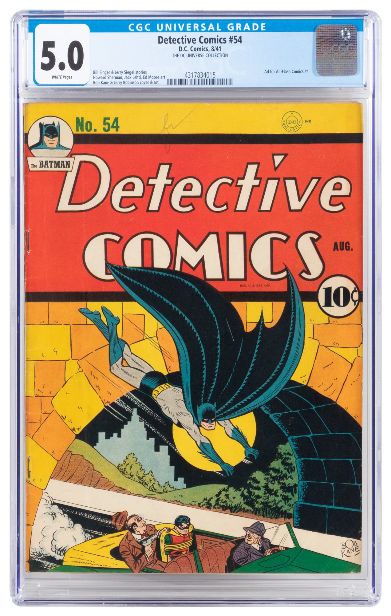
My favorite example of this (that I lovingly discuss) is from the cover of Detective Comics #45 (August, 1941). I will direct you to the Batman logo in the top left corner and the situation in the car. The editor decided to fix whatever “mistake” they saw by putting… dots for eyes? Details like the stripes on a gangster’s suit, the Robin symbol, the gun, and Robin’s hair are either dramatically different, or removed entirely. They did not do Bob Kane and Jerry Robinson justice to say the least. While certainly fine for most, these changes and mistakes in the reprinting and retouching process may require others to seek out the originals, or exact color copies of the original. For an artist trying to mimic the styles of the original artists for example, the reprints would not be very useful. I have these images below. The initial brighter images are how it is found in reprints found in DC Universe Infinite and Batman: The Golden Age Omnibus Vol. 1, and the duller images were pulled from an auction listing photo of an original copy.


Wabi-Sabi in Comic Books
This lesson in four color at the library was a bit of a Zen revelation for me; in particular, the prevailing tea ceremony (茶の湯) concepts of wabi (詫), sabi (寂), and aware (哀れ). Wabi is often translated as understated beauty. Used in the context of tea implements, something is wabi when it is imperfect or asymmetrical. A teacup where the glaze is seemingly random and uneven. Sabi is rustic, something that has aged well. Finally, aware is an awareness of the transient nature of things, an essential concept in Buddhism. Nothing ever stays the same. The flower you see today may still be there tomorrow, but it’s a little different than the one you saw earlier. This is simultaneously sad and beautiful (Parkes and Loughnane 2024).
A popular example of these concepts is called kintsugi (金継ぎ), where a broken tea cup that would normally be thrown away and replaced is instead repaired with gold. The new cup is often considered more beautiful and valuable than the original. It is imperfect, therefore wabi. The wear and repairs give it an old rustic feel, so sabi. Aware is found in the idea that the cup is no longer the cup it once was. It has become something new and will become something different in time.
It was these concepts that struck me all at once while perusing the library’s collection without a specific aim. I wasn’t looking for anything in particular, so I found myself taken in by all the minor peripheral details that might otherwise be ignored or seen in a negative light. A large part of this experience is the dots and coloring “mistakes” as explained above, but also each book had a story to tell me. Stamps and names penciled in from previous owners/readers and cover creases were like tattoos. Rusty staples became bruises while rips in the corner were battle scars.
Golden – Silver – Bronze – Perfect Age?
I don’t think I am alone in this experience. These books aren’t despised for these imperfections. If anything, they are loved at least partially for these imperfections. Some fans will defiantly tell you how it was the best era of comic books. On the other hand however, as comic book lovers we increasingly value perfection. Just go on reddit to any fan subreddit and you’ll see users complaining about even minor imperfections in a book they received in the mail. The new clerk at my local comic shop hands me my new comic books, asking me to check them, seemingly nervous I might get mad at the condition of one of the copies they pulled for me.
New comics are instantly put in an acid-free bag and hidden away. Even the way that we evaluate the books is with a mindset towards perfection. A service like CGC grades a book’s condition on a scale of 10 with 10 being a perfectly pristine item. “Defects” like off-white pages or slight spine creases can lower your score dramatically, and everyone wants their book to be as perfect as possible. It’s then slabbed or encased in hard plastic to (most likely) never be removed and read again.
As long as I can read it, I’m good! I’m not careless with my things, but they were made to be used. And even if you take the best care of it—like museum level care—change is inevitable. I mean, if you start thinking about all the things that can mess up your valuables (sunlight, temperature, water and humidity, skin oils, a slight slip of the hand, etc.), it can drive you crazy… and I’m so not speaking from personal experience. So, I’ve kept new books I bought online that arrived with dented and ripped corners. Because instead of seeing it as a flaw, I just think that the book has personality. It has a life of its own. Each ding on the book tells a story of the life it’s had. If we make that ding, even better! It’s a personal memory (like the coffee spilled on my Hush Omnibus).
This is not me trying to come from the moral high ground, because I think all acts of love and devotion to the art form are of value and valid. For example, while I may not a fan of the aforementioned slabbing, I do appreciate that that book will be well preserved for generations to come. What I am trying to say though is that by aiming for perfection, we are losing some of that beautiful imperfection. We need to give our comic books the space to be a little imperfect, to be accessible to ourselves and others. And we should take the time to appreciate how the imperfections add to the experience, making each book one-of-a-kind!
More importantly, I use these differences in color and these Zen ideas to illustrate another reason why accessibility is immensely important. We already discussed its importance in getting a full and complete look at the work (e.g., the ads). Now we’re talking about getting a look at the original (or as close to it as possible like with the microfiche) to see it in its unedited imperfect glory. Color outside the lines and all. If you don’t have access to it, you can’t know all of these details—and more!—in an intimate, first-hand way. You can’t compare original vs. reprint, old vs. new. This is why we need these materials to be publicly accessible. For the art historian who wants to look at printing technology. For a researcher who appreciates the imperfections of the reprints but requires an unedited experience to be as factual as possible. For the kid who just wants to look at some old comic books and take in the nostalgia of it without paying $1000+. Give us our history. Give us a moment of wabi-sabi. Give us books free from editing and/or censorship.
Notes
*This makes me think of Apple’s Retina Display which premiered in the iPhone 4 in 2010. I can still remember Steve Jobs making the announcement with excitement. Not being able to see the individual pixels on your tech device when held in normal range (i.e., not right in front of your eyes) was groundbreaking technology for average consumers at the time. In a way, comic books had the original “Retina display” of paper.
References
Amendola, Sal, Howard Chaykin, Jim Aparo, and Archie Goodwin. 1974. Judgement Day. Vol. 1. Detective Comics 441. New York, NY: National Periodical Publications, Inc.
Ellsworth, Whitney, and Paul Santos, eds. 2023. Batman: The Golden Age Omnibus. 2023 Edition. Vol. 1. 10 vols. Burbank, CA: DC Comics.
Grant, Steven (w), and Shawn McManus (a). 1993. Turf Pt. 1. Edited by Bill Kaplan and Archie Goodwin. Vol. 1. Batman: Legends of the Dark Knight 44. New York, NY: DC Comics.
Hilgart, John. 2010. “In Defense of Dots: The Lost Art of Comic Books.” Blog. 4CP | Four Color Process (blog). December 2010. https://4cp.posthaven.com/in-defense-of-dots-the-lost-art-of-comic-book.
Kane, Bob, and Jerry Robinson. 1941. Hook Morgan and His Harbor Pirates. Vol. 1. Detective Comics 54. New York, NY: Detective Comics Inc.
Kane, Bob, and William Woolfolk. 1953. The Stolen Bank. Edited by Jack Schiff. Vol. 1. Detective Comics 194. New York, NY: National Comics Publications, Inc.
Parkes, Graham, and Adam Loughnane. 2024. “Japanese Aesthetics.” In The Stanford Encyclopedia of Philosophy, edited by Edward N. Zalta and Uri Nodelman, Spring 2024. Metaphysics Research Lab, Stanford University. https://plato.stanford.edu/archives/spr2024/entries/japanese-aesthetics/.
Vincenzo, Darren (w), and Luke McDonnell (a). 1999. The Darkness. Edited by Kaplan, Bill and Goodwin, Archie. Vol. 1. Batman: Legends of the Dark Knight 115. New York, NY: DC Comics.
Waid, Mark, and Dan Mora. 2024. Impossible Part Four. Edited by Paul Kaminsky and Chris Rosa. Batman/Superman: World’s Finest. Burbank, CA: DC Comics.
Leave a Reply